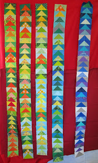
That chunk of darker red solid finally turned up and I hung it up on the bottom half of the design wall to see which red I liked better.
I had really thought that I was going to like the dark better, but now I'm not so sure.
Here's a closer look at the dividing line:
and here's the light red:
and here's the dark:
Contrary to what I expected, I think the lighter brighter red is the one I'll go with. It really lights up the colors of all those highs and lows, while the darker red seems to dull them down.
Here's one more look at the contrast, along with three more Sand Castle blocks I got done yesterday.
So if red is the new neutral, then bright red is the neutralest neutral? Whichever, I'm going with the bright one.
There. That dither is over. Next!
Linking with SoScrappy for ScrapHappy Saturday, and with Quilting is more fun than Housework for Oh Scrap! Come join the fun!


18 comments:
Lol! Yes it's the most neutralistic of them all. Hahaha! I love the brighter red too. Enjoy! ;^)
I was favoring the darker red, until I read your explanation. You are so right! Go for it.
YES!! The lighter, brighter red is the perfect choice. It lets those goosey temps just sing.
Yep, the bright red looks best on my computer screen. Who would have guessed?
Definitely yes on the brighter red! Your temperature quilt is one of my favorites that I've seen!
Wow, I like the lighter, brighter one better too!! It’s perfect!!!
At first glance, I thought I liked the darker red better. A closer look brought me to the same conclusion you made. The bright red is definitely the way to go!
Oooh I love the colour show in this temperature quilt and the lighter red really makes the flying geese pop!
Good choice, Gayle! I like the lighter red, too. It's interesting how a subtle difference in color can make such an impact.
Definitely use the brighter red. It shows up the colours in your flying geese strips so well.
Your first red is my favorite. Of course it is, it leans toward orange :)
Thanks for sharing with Oh Scrap!
What about using the brighter red in the centre and the darker one on the outsides, then they both get to be part of the quilt and won't be sad?!? LOL
I like the brighter one also. Of course I like anything/everything red! :)
Hmmm....could you use both reds? I can kind of envision the sashing trending hotter or colder as the flying geese do . . .
Glad you found the perfect red!
Hooray for that brighter and happier red -- most excellent choice.
Perfect!
Red is my favorite color. Thank you fo making it the new neutral!
Post a Comment