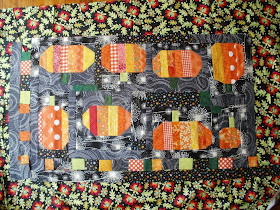
(That may be my newest exclamation of dismay...)
I've hit a speedbump with the pumpkins.
I got all the puzzle pieces assembled, using my just-chop-off-the-extra technology(learned from my Gwennie medallion adventure) -
and got all the blocks to fit into one big pumpkin patch.
(Pardon my toes in that last picture. I'm using my daughter's laptop and it has hidden from me all the pictures I just cropped and edited oh-so-tediously for this post. Rather than going off on an extended period of searching and cursing, I'm just pulling them in raw off the smart card and calling it a day...)
My original plan was to use this print for a border,
but it's much too busy and just overwhelms my poor pumpkins.
So I tried laying out some intervening borders,
which I like, but still think that print's gotta go.
I went ahead with the dotty border, but that's when I hit the speedbump.
I've got two ideas, and am having a hard time choosing between them.
Green?
Or black?
I'll just be over here in the corner, dithering...


First, I like the little bits in the inner border. The green makes me feel like the pumpkins are still on the vine, it's less Halloween-y, and it helps the green bits in the center "make sense." But I don't think you can go wrong with the black, either. How's that for dithering?
ReplyDeleteI like the black, but the white part of the background print is glaring at me, so I just wanted something matchy, matchy....the real life colours are probably very different. I laughed when you said you would be dithering the in corner, I so feel like that about colour choice sometimes!
ReplyDeleteBlack!!! I vote black! Definitely black. How's that for not dithering? I wish I could be as decisive with my own quilt color choices....sigh....
ReplyDeleteGreen. The green adds so much and ties in the green in the blocks. I know about dithering. I think I dither more often that I sew/make quilts -- at least sometimes.
ReplyDeleteI think Green... the dotty is still a touch on the busy side, the green calms everything down nicely, while still remaining a touch dramatic.
ReplyDeleteBoth! Use green for the inside border and the black for the outside border. Bind in the busy print. Or green for the border and bind in the black print. LOL Your choice!
ReplyDeleteI think green tonal. Eyes need a place to 'rest' from all the busy. Just cheerful!
ReplyDeleteI love these pumpkins (and your blog) and add my vote for green.
ReplyDeleteI agree--the first print is a little cray-cray. I would go with the green--it adds a bit of rest for the eye for me.
ReplyDeleteIf they are gwennie improv pumpkins, does that mean you're going to carve faces into them?
ReplyDeleteAnd now you know why most of my quilts are borderless...I'm not into dithering! (My mind says green w/o a dither).
ReplyDeleteVery pretty pumpkin patch!
ReplyDeleteIf you haven't made this decision yet I vote for the black. Maybe they'll be ready for next year? Although there's still Thanksgiving... !
ReplyDelete