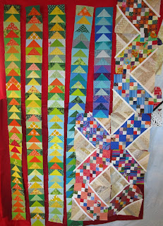
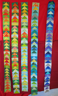
Or possibly dueling. Tough call. The design wall is definitely filling up.
Though I seem to have warped the space/time continuum as far as my Sand Castle blocks are concerned. I counted them and found I needed four more. So I made a whole bunch of blocks and counted them all up again, and I still need four more.
I'm starting to suspect the Sand Castle bin has a black hole in the bottom...
Eventually I'll have enough blocks. Really. I'm sure of it.
There hasn't been as much time to sew lately, what with Thanksgiving and other holidays crowding the calendar. I've got a lot of gifty projects going on behind the scenes, but I can't show them off yet. (If I remember to take pictures, I'll share them after the holidays.)
I did get some fabrics pulled and cut for Frolic. I've been digging through my scrap bins and gathering strips and generally getting ready for the clues to start dropping.
Clue one appeared yesterday, and though I didn't get any time to sew, I did get some strips ready for assembly.
Tomorrow the stitching will commence! Four-patches are always full of fun!
Linking with SoScrappy for ScrapHappy Saturday and Quilting is more fun than Housework for Oh Scrap. I'm even going to try this new-fangled Instagram thing and post a pic or two. Modern times, eh?
Saturday, November 30, 2019
Sunday, November 10, 2019
Well now, here's a surprise
That chunk of darker red solid finally turned up and I hung it up on the bottom half of the design wall to see which red I liked better.
I had really thought that I was going to like the dark better, but now I'm not so sure.
Here's a closer look at the dividing line:
and here's the light red:
and here's the dark:
Contrary to what I expected, I think the lighter brighter red is the one I'll go with. It really lights up the colors of all those highs and lows, while the darker red seems to dull them down.
Here's one more look at the contrast, along with three more Sand Castle blocks I got done yesterday.
So if red is the new neutral, then bright red is the neutralest neutral? Whichever, I'm going with the bright one.
There. That dither is over. Next!
Linking with SoScrappy for ScrapHappy Saturday, and with Quilting is more fun than Housework for Oh Scrap! Come join the fun!
Sunday, November 3, 2019
September now hath 30 days
Well, a quick check of the Weather Underground site (which is my source for my area's daily high and low temperatures) gave me the data for my missing September 30th flying goose.
Ta-da!
And after endless auditions of fabrics for sashing for these columns, I finally found a solution. (I even dug out my January column and stuck it up on the right to make sure the winter months would look good, too)
I'd really painted myself into a corner with my color selections for this quilt. Everything was in use: gray, white, purple, blue, turquoise, green, yellow, orange, and red. That left brown or hot pink, both of which looked awful. (trust me...)
I tried black, but the darker blues disappeared into it.
Dots, spots, and jots didn't work.
Stripes looked weird, whether I ran them horizontally or vertically.
And seriously, with all that color chaos, the sashing needed to be a solid of some sort just to calm things down.
I was really starting to despair when I had a sudden thought. The only colors that I had to worry about were the ones representing the low temperatures because the 'geese' triangles stood for the highs and never touched the edges. And since red represents temperatures about 90F, and because the nights (the lows) were never in the 90's (because seriously? If the nights were in the 90's, I would have already moved to the north pole and I'd have had to start a whole other quilt anyway), that meant red was in play for a sashing possibility.
So, I gave it a try and it works! And since the world is basically on fire nowadays, it seems like an appropriate choice.
I've got a darker shade of red somewhere in my stash which I'm going to dig out and audition before I start cutting. But whew! That's a load off my mind!
Saturday, November 2, 2019
Goosey goosies and a pile of sandcastles
Here's a look at my design wall as of the first of November. I've been plugging away at my Sand Castle blocks for the RSC, catching up with the colors that I got behind on over the summer.
And now that we've started November, I can complete the October column of flying geese for my Goosey Temps quilt. Though when I hung it up next to September, I noticed a slight problem. The September column seemed a bit short. (It's the one next to last on right)
So, I counted up the blocks and came up with only 29. Not right. I even ran the old rhyme through my head to double check. (Thirty days hath September... yep. Not right.)
Determined to fix that oversight, I grabbed the pocket calendar that I use to record the temperatures and checked September.
I think I've found the problem.
Did I sleep through September 30th? It did seem like September was awfully short...
Linking with SoScrappy for ScrapHappy Saturday, and with Quilting is more fun than Housework for Oh Scrap! Come check out all the scrappy goodness!
Friday, November 1, 2019
Beginning to Frolic
Bonnie Hunter announced her Mystery Quilt for 2019 yesterday and I'm already pulling fabrics. Preparing to Frolic!
When I first saw her colors, my mind insisted on seeing purple in place of her blues. I kept scanning down through her list and going 'hmm.' Blues - check; fuchsia - always a good choice; aqua - eh I guess; limey green? Starting to pause here.
But I gave it the benefit of the doubt and started rooting around in my stash.
And, well, okay. It looks a little better in this photo than it did on the cutting table, but...
I realized that my heart was still yearning for those purples I'd first imagined. Back to the stash I went and grabbed the nearest purples. And then I decided a bricky red/orange would look good with them, so I grabbed those too. Then a couple of blues took the place of the aqua, and a golden yellow jumped in to sub for the lime-ass green.
Oh, yeah. That's floating my boat a whole lot better.
And then I found a 2-yard piece of a nice butter yellow which would look good and be a great plenty for that yard and a half of constant.
I think I'm ready!
Though I had a funny deja vu feeling the whole time I was pulling these fabrics. Then I had to laugh when I realized that I'd done this pull before when I was planning a(n as yet unstarted) bag.
I may be frolicking down a yellow brick road!


